Data visualization is a crucial step in data analysis, helping to convey insights clearly and effectively. While there are numerous tools available for visualizing data, the Pandas library offers an easy and powerful way to create various plots directly from your DataFrame. In this blog post, we’ll explore how to plot a DataFrame using Pandas, with practical examples and simple explanations suitable for beginners.
Let’s dive in!
Introduction to Pandas Plotting
Pandas is primarily known as a data analysis tool, but it also provides several built-in plotting capabilities that make data visualization straightforward. The plot() method in Pandas allows you to create a wide range of plots with minimal code, leveraging the powerful Matplotlib library under the hood.
Whether you’re interested in line plots, bar charts, histograms, or scatter plots, Pandas makes it simple to visualize your data directly from a DataFrame. In this tutorial, we’ll guide you through different types of plots and show you how to create them using Pandas.
Importing Libraries and Data
Before we start plotting, we need to import the necessary libraries and load the dataset we’ll be working with. For this tutorial, we’ll use a dataset containing the weekly closing prices of Facebook (Meta), Microsoft, and Apple stocks.
import pandas as pd
import numpy as np
import matplotlib.pyplot as plt

# Load the dataset
dataset_url = 'https://raw.githubusercontent.com/datatweets/pandas_tutorials/main/weekly_stocks.csv'
df = pd.read_csv(dataset_url, parse_dates=['Date'], index_col='Date')

# Display the first few rows of the DataFrame
print(df.head())
This code imports the essential libraries and loads the dataset into a Pandas DataFrame. The parse_dates parameter ensures that the ‘Date’ column is recognized as a date, and index_col='Date' sets it as the index of the DataFrame.
Line Plot: The Default Plot
The default plot in Pandas is the line plot, which is ideal for visualizing time series data. In a line plot, the x-axis typically represents time, and the y-axis represents the data values.
Plotting a Single Line
Let’s start by plotting the performance of Microsoft (MSFT) over the previous year:
df.plot(y='MSFT', figsize=(9,6))
plt.title('Microsoft Stock Prices Over Time')
plt.ylabel('Price in USD')
plt.show()
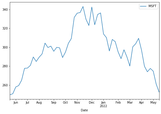
This code creates a simple line plot with the date on the x-axis and the Microsoft stock price on the y-axis. The figsize parameter controls the size of the plot.
Plotting Multiple Lines
To compare the performance of multiple companies, we can plot several lines on the same graph:
df.plot(y=['FB', 'AAPL', 'MSFT'], figsize=(10,6))
plt.title('Stock Prices of Facebook, Apple, and Microsoft')
plt.ylabel('Price in USD')
plt.show()
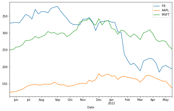
Here, we plot the stock prices of Facebook, Apple, and Microsoft on the same chart, making it easy to compare their performances over time.
Bar Plot: Comparing Categories
Bar plots are useful for comparing quantities across different categories. In this section, we’ll create bar charts to visualize the average monthly stock prices.
Creating a Vertical Bar Plot
First, let’s calculate the average stock prices for the last three months:
df_3Months = df.resample('M').mean()[-3:]
print(df_3Months)
Now, let’s create a bar plot:
df_3Months.plot(kind='bar', figsize=(10,6), ylabel='Price in USD')
plt.title('Average Monthly Stock Prices')
plt.show()
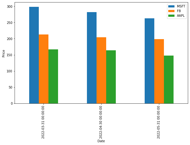
Creating a Horizontal Bar Plot
You can also create a horizontal bar plot by setting kind='barh':
df_3Months.plot(kind='barh', figsize=(9,6))
plt.title('Average Monthly Stock Prices (Horizontal)')
plt.xlabel('Price in USD')
plt.show()
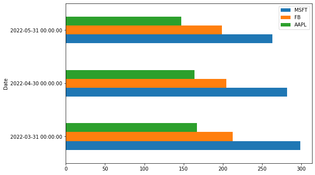
Stacked Bar Plot
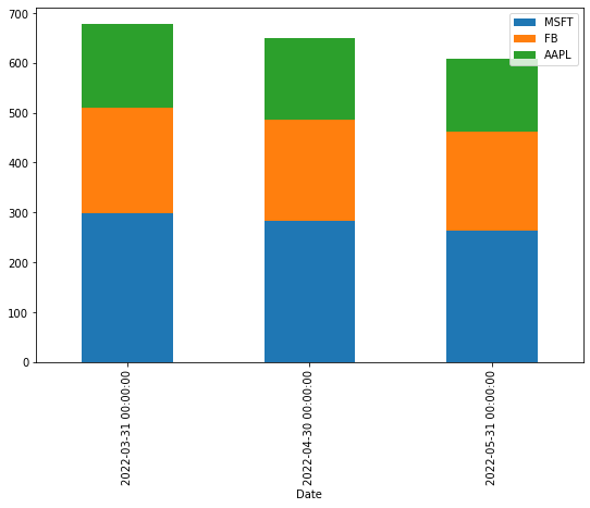
A stacked bar plot combines different data groups in a single bar. Here’s how to create one:
df_3Months.plot(kind='bar', stacked=True, figsize=(9,6))
plt.title('Stacked Bar Plot of Average Monthly Stock Prices')
plt.ylabel('Price in USD')
plt.show()
Histogram: Visualizing Data Distribution
A histogram is perfect for understanding the distribution of data. It groups data into bins and shows the frequency of data points within each bin.
df[['MSFT', 'FB']].plot(kind='hist', bins=25, alpha=0.6, figsize=(9,6))
plt.title('Histogram of Microsoft and Facebook Stock Prices')
plt.xlabel('Price in USD')
plt.show()
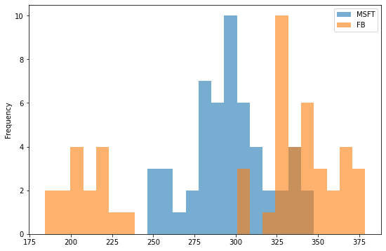
The bins parameter controls the number of bins, and alpha controls the transparency of the bars.
Box Plot: Summarizing Data
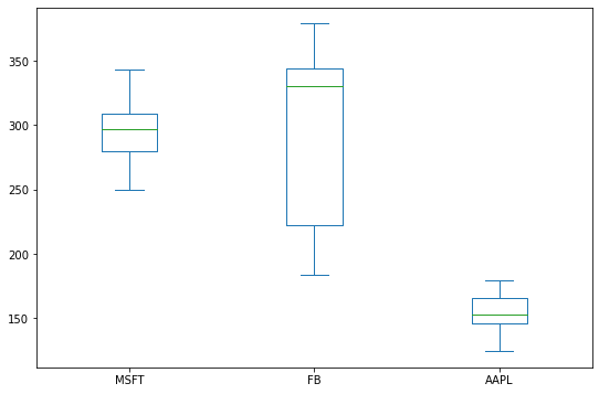
A box plot provides a summary of data, showing the median, quartiles, and outliers.
df.plot(kind='box', figsize=(9,6)')
plt.title('Box Plot of Stock Prices')
plt.show()
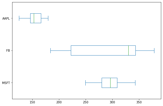
You can also create a horizontal box plot by setting vert=False:
df.plot(kind='box', vert=False, figsize=(9,6))
plt.title('Horizontal Box Plot of Stock Prices')
plt.show()
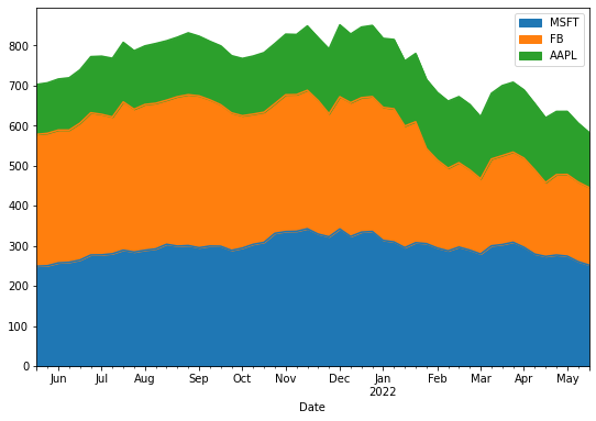
Area Plot: Showing Cumulative Data
An area plot is similar to a line plot, but it fills the area under the line.
df.plot(kind='area', figsize=(9,6))
plt.title('Area Plot of Stock Prices')
plt.ylabel('Price in USD')
plt.show()
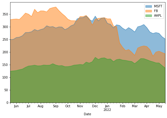
To unstack the area plot, set stacked=False:
df.plot(kind='area', stacked=False, figsize=(9,6))
plt.title('Unstacked Area Plot of Stock Prices')
plt.show()
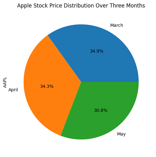
Pie Plot: Visualizing Proportions
Pie plots are great for showing proportions within a dataset. Here’s how to create one:
df_3Months.index=['March', 'April', 'May']
df_3Months.plot(kind='pie', y='AAPL', legend=False, autopct='%1.1f%%', figsize=(6,6))
plt.title('Apple Stock Price Distribution Over Three Months')
plt.show()
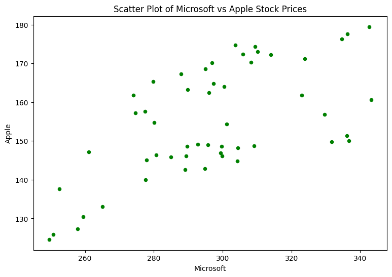
Scatter Plot: Exploring Relationships
Scatter plots show the relationship between two variables. Here’s an example:
df.plot(kind='scatter', x='MSFT', y='AAPL', color='Green', figsize=(9,6))
plt.title('Scatter Plot of Microsoft vs Apple Stock Prices')
plt.xlabel('Microsoft')
plt.ylabel('Apple')
plt.show()
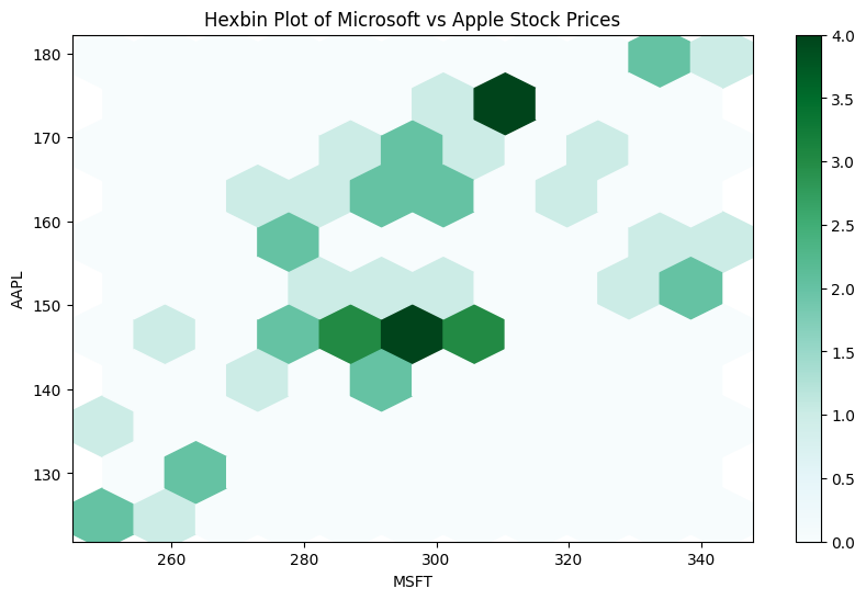
Hexbin Plot: Handling Dense Data
For dense data, a hexbin plot is a better alternative to a scatter plot:
df.plot(kind='hexbin', x='MSFT', y='AAPL', gridsize=10, figsize=(10,6))
plt.title('Hexbin Plot of Microsoft vs Apple Stock Prices')
plt.show()
KDE Plot: Visualizing Probability Density
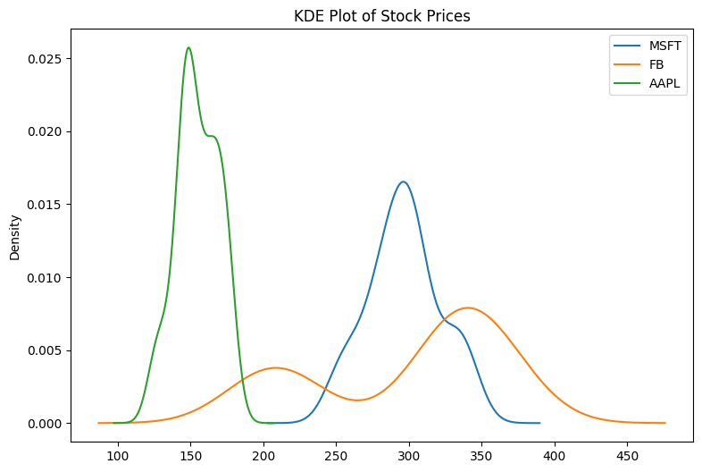
The Kernel Density Estimate (KDE) plot shows the probability density of a continuous variable.
df.plot(kind='kde', figsize=(9,6))
plt.title('KDE Plot of Stock Prices')
plt.show()
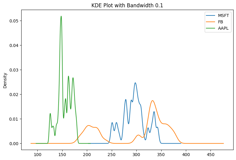
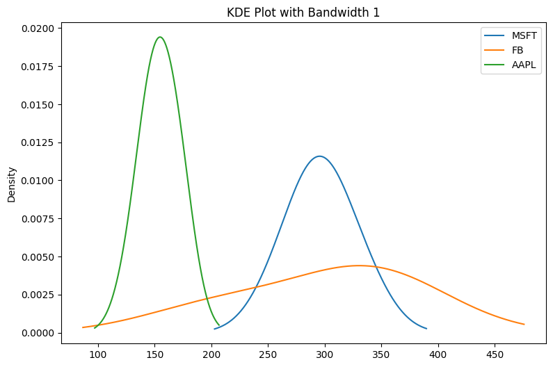
You can adjust the smoothness using the bw_method parameter:
df.plot(kind='kde', bw_method=0.1, figsize=(9,6))
plt.title('KDE Plot with Bandwidth 0.1')
plt.show()
df.plot(kind='kde', bw_method=1, figsize=(9,6))
plt.title('KDE Plot with Bandwidth 1')
plt.show()
Conclusion
In this tutorial, we explored how to use Pandas for data visualization. We covered various plot types including line plots, bar charts, histograms, box plots, and more. By leveraging Pandas’ plot() method, you can create informative and visually appealing plots with minimal effort.
Visualizing data is an essential part of any data analysis process, and with Pandas, you have a powerful tool at your disposal to create a wide range of plots directly from your DataFrame.
Feel free to connect with me on LinkedIn and Twitter, and happy plotting!